
Celebrating The World In a Weekend

Edmonton is often called the “Festival City”, and the Edmonton Heritage Festival is one of the city’s most established and beloved cultural events.
What began in 1976 with 11 ethno-cultural communities has grown into the world’s largest three-day celebration of multiculturalism, bringing together food, music, dance, storytelling and hundreds of thousands of visitors each summer.
Built by volunteers and powered by cultural communities, the festival lets Edmontonians experience the world without leaving home.

The festival did not need to become important. It needed a brand that reflected how important it already was.
Edmonton Heritage Festival had substantial awareness, loyalty and cultural importance, but its brand expression had become fragmented and overly functional.
Across its website, social channels and marketing materials, logistical information often came before emotional meaning. Language varied between platforms. The identity was difficult to apply consistently, and communications did not fully capture what the festival feels like or why it matters.
People come to experience the world. They leave feeling closer to home.
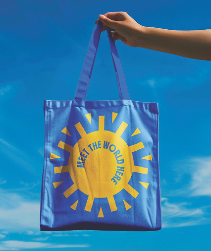
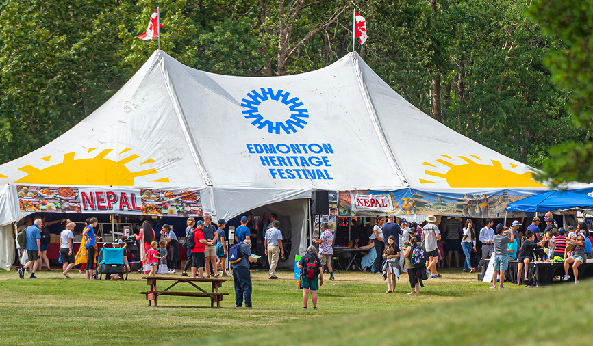
Food, music and performance bring people through the gates, but the lasting value of the festival is connection.
Visitors discover new flavours and traditions while recognizing familiar emotions that connect them all: pride, family, hospitality, joy and belonging.
The research showed different audiences arriving for different reasons: discovery and shareable moments for younger visitors, affordable family time for parents, an annual ritual for established festival-goers, pride and ownership for the cultural communities themselves. The platform had to unite those motivations without becoming generic, and connection was the thread that ran through all of them.
The brand needed to move, sound and taste like the event.

The world in a weekend.
A clear, memorable statement that turns the festival’s scale into a personal invitation.
It captures global discovery, local accessibility and the extraordinary amount of culture available in a single Edmonton weekend.


The new icon is built from 11 “H” forms arranged around a shared centre, honouring the 11 ethno-cultural communities that participated in the first Edmonton Heritage Festival in 1976.
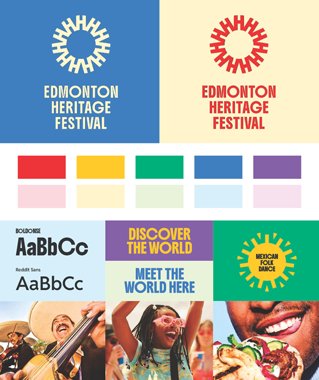
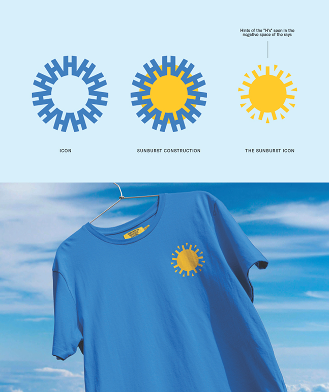
The negative space within the primary icon creates the Sunburst, a flexible secondary symbol representing warmth, summer and the energy of a weekend shared.
The supporting imagery was updated to reflect the breadth of the cultural experience, focused on food, community and connection. And the colour palette received a bold update. The expanded spectrum allows the brand to experiment with new frameworks and materials that reflect the diversity and range of experiences. It was also developed with accessibility and readability in mind so that every festivalgoer can experience the excitement of the new brand.
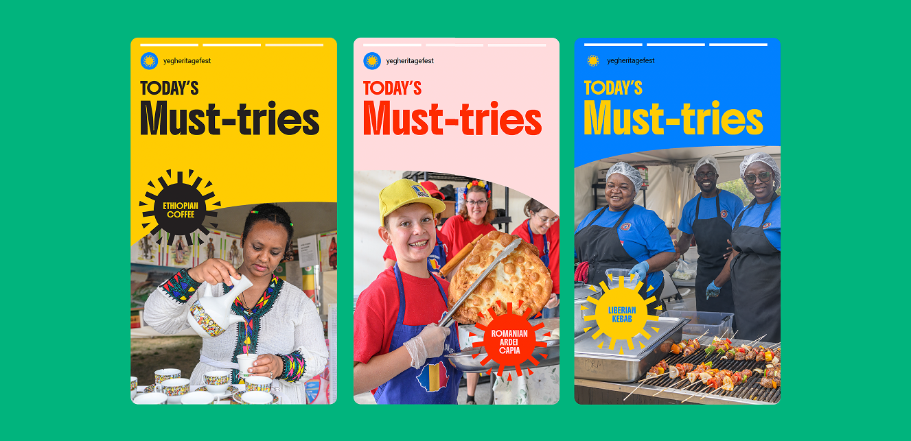
The refreshed brand not only reflects the rich experience that festival attendees have, but it creates more meaningful ways to engage and participate with it.
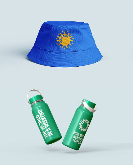
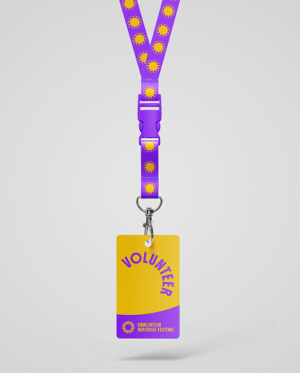
The refreshed brand gives Edmontonians an invitation to the festival that is clear, culturally rich and full of joy.
It honours the communities that created the festival, makes discovery more compelling to new audiences and gives the organization a stronger platform for future growth.
At a time when people are feeling increasingly divided and disconnected, Edmonton Heritage Festival offers a joyful counterpoint.
For one weekend, every year, the festival makes the world feel larger and Edmonton feel closer.

